Project Overview
Airthings required a comprehensive UX design for their website 3.0, aimed at improving user engagement with Airthings for the purpose of designing the User Experience (UX) for Airthings Website 3.0.
Who are Airthings?
Airthings is a Norwegian company founded in 2008 that specializes in air quality monitoring solutions. They create devices that measure indoor air pollutants like radon, CO2, humidity, and VOCs, providing real-time data through user-friendly apps. Their mission is to enhance health and well-being by promoting better indoor environments for both residential and commercial users.
Project challenges
“How can we ensure that the brand remains the central focus while achieving an ideal balance between consumer, business, and professional prominence?”
“How can we prioritise the brand in a way that enhances conversions for all business units?”
My Approach
The following are just snippets of the work I carried out during this phase of work.
User stories
To identify the core pain points of our users by taking a balanced first approach and position ourselves to be a market leader in the clean air space

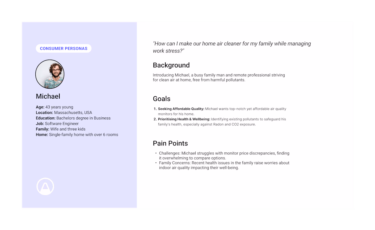
User personas per each business unit

Prioritised and categorised user personas
User personas using real data
In depth persona creation leading to a deeper user connection.
Competitor analysis
How we can structure and layout our content. Using a hierarchy structure type, we started with broader categories of info (parent) and then drilled further down into the structure to find more detailed info (child). This enabled us to have a more detailed approach into our balanced content layout.
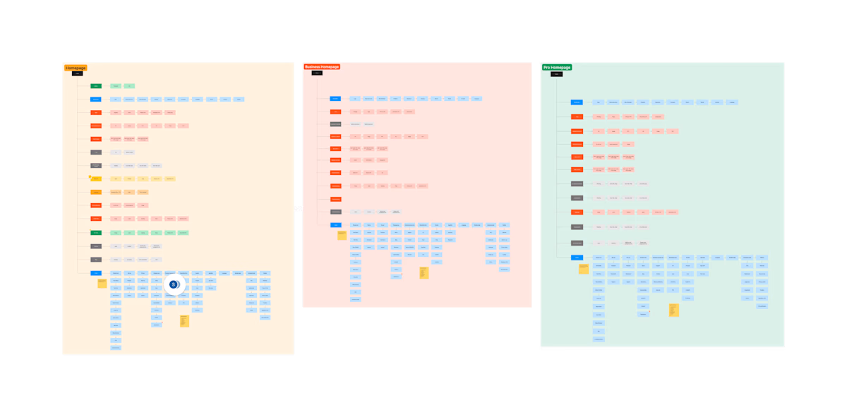
Information architecture of web pages
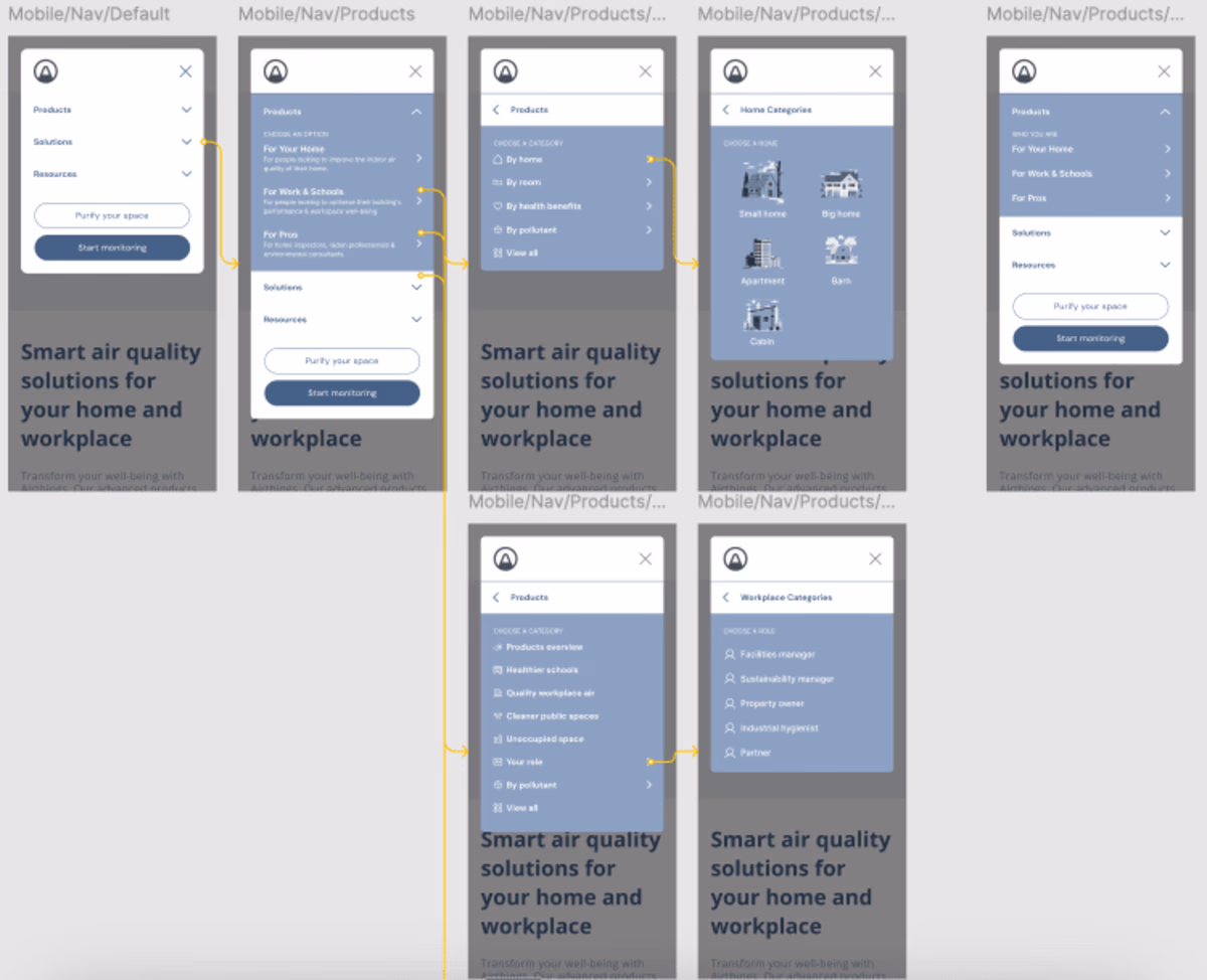
Wireframes
After carrying out our in depth user research, this provided us make more data informed design decisions when it came to our wireframes, specifically including the navigation, which was of highest priority to the internal stakeholders.
The user needs to be able to find what their looking for from each business units users point of view without harming the consumer conversion rate.
This phase of the project has come to a close as we are awaiting a reorganisation of the company before proceeding with phase two.